边学边记录,如果你看到了,参考即可,不保证说的完全正确,
拥有多个子元素的布局widget
- Flow
带动画效果的例子
通过decoration参数来处理child的显示位置
            Container(
              height: 100,
              decoration: BoxDecoration(border: Border.all(color: Colors.amberAccent)),
              child: Flow(
                delegate: MyFlowDelegate(),
                children: menuItems.map<Widget>((IconData icon) => flowMenuItem2(icon)).toList(),
              ),
            ),
简单实现
class MyFlowDelegate extends FlowDelegate{
  @override
  void paintChildren(FlowPaintingContext context) {
   for(int i=0;i<context.childCount;i++){
     var matrix4=Matrix4.translationValues(context.getChildSize(i).width*i, 0, 0);
//matrix4 来决定显示的位置,大小,旋转等属性
     context.paintChild(i,transform: matrix4);
   }
  }

  @override
  bool shouldRepaint(FlowDelegate oldDelegate) {
    return false;
  }

}
- Row
类似线性布局的水平方向, - Column
类似线性布局的垂直方向, - Stack
类似FrameLayout,参数上篇有介绍
  Stack({
    Key key,
    this.alignment = AlignmentDirectional.topStart,
    this.textDirection,
    this.fit = StackFit.loose,
    this.overflow = Overflow.clip,
    List<Widget> children = const <Widget>[],
  })
- IndexedStack
继承Stack,多了个index参数,而且不是所有的child都显示,只有index那个child才显示,类似android里的ViewAnimator或者ViewSwitcher
  IndexedStack({
    Key key,
    AlignmentGeometry alignment = AlignmentDirectional.topStart,
    TextDirection textDirection,
    StackFit sizing = StackFit.loose,
    this.index = 0,
    List<Widget> children = const <Widget>[],
  })
- Table
  Table({
    Key key,
    this.children = const <TableRow>[],
    this.columnWidths,//如果设置了这个,那下边default的就无效了
    this.defaultColumnWidth = const FlexColumnWidth(1.0),//默认的item宽是平分的
    this.textDirection,
    this.border,//边框
    this.defaultVerticalAlignment = TableCellVerticalAlignment.top,//item在垂直方向的重心
    this.textBaseline,
  })
测试代码
              Table(
                columnWidths: _getColumnWidth(),
                defaultVerticalAlignment: TableCellVerticalAlignment.middle,
                children: <TableRow>[
                  TableRow(
                      decoration: BoxDecoration(color: Colors.amberAccent),
                      children: [
                        Text(
                          "first line ...",
                          textAlign: TextAlign.center,
                        ),
                        FlatButton(onPressed: () {}, child: Icon(Icons.build))
                      ]),
                  TableRow(
                      decoration: BoxDecoration(color: Colors.redAccent),
                      children: [
                        Text("second line ........",
                            textAlign: TextAlign.center),
                        FlatButton(onPressed: () {}, child: Icon(Icons.build))
                      ]),
                  TableRow(
                      decoration: BoxDecoration(color: Colors.deepPurple),
                      children: [
                        Text("third line ............",
                            textAlign: TextAlign.center),
                        FlatButton(onPressed: () {}, child: Icon(Icons.build))
                      ]),
                ],
              ),

//这里简单就弄下,左边的flex是1,右边的是2,图片可以看出效果
  Map<int, TableColumnWidth> _getColumnWidth() {
    var map = HashMap<int, TableColumnWidth>();
    for (int i = 0; i < 6; i++) {
      map[i] = IntrinsicColumnWidth(flex: i % 2 + 1.0);
    }
    return map;
  }
效果图

看下几种默认的TableColumnWidth的实现类

6.1 设置比重的
//Creates a column width based on intrinsic sizing. This sizing algorithm is very expensive.
 const IntrinsicColumnWidth({ double flex })
6.2 固定值
//Creates a column width based on a fixed number of logical pixels.
  const FixedColumnWidth(this.value)
6.3 和table的最大宽的百分比,换句话说,column的宽就是下边这个因子乘以Table的宽
//Creates a column width based on a fraction of the table's constraints' maxWidth.
const FractionColumnWidth(this.value)
6.4
比重是多少,和6.1有点像
const FlexColumnWidth([this.value = 1.0])
6.5
取参数a,b两者算出来的最大值
  const MaxColumnWidth(this.a, this.b);
  /// A lower bound for the width of this column.
  final TableColumnWidth a;

  /// Another lower bound for the width of this column.
  final TableColumnWidth b;
简单总结下:
这玩意是个表格,也就是大家每行的列数数必须一样,每列的宽度也是一样的,你修改了其中一列的宽,其他列也会跟着变的
对齐方式
如果每列都是文字,而高度有不一样,用baseline对齐比较好看点
defaultVerticalAlignment: TableCellVerticalAlignment.baseline,//用这个的话下边的那个必须设置
                  textBaseline: TextBaseline.alphabetic,
- Wrap
  Wrap({
    Key key,
    this.direction = Axis.horizontal,
    this.alignment = WrapAlignment.start,
    this.spacing = 0.0,
    this.runAlignment = WrapAlignment.start,
    this.runSpacing = 0.0,
    this.crossAxisAlignment = WrapCrossAlignment.start,
    this.textDirection,
    this.verticalDirection = VerticalDirection.down,
    List<Widget> children = const <Widget>[],
  })
类似android里的Flow,一个挨一个的放,放不下就换行
            Wrap(children: <Widget>[FlatButton(onPressed: (){}, child: Text("测试文字长点。。。。。。。。。。。。。。。。。")),
            Text("第二个文字算了算了是了算了算了是算了算了绿色是老师老实",style: TextStyle(color: Colors.deepPurple,fontSize: 35),)
            ,Text("第三个"),Text("第四个")],),
            ],

- ListBody
看起来和ListView以及Column/Row很像,啥区别?
ListBody强制child的宽为它的容器的宽【垂直方向而言】,不可滚动
ListView宽度为容器宽,需要确定的高度,可以滚动
Column 宽度为wrap,不可滚动
  ListBody({
    Key key,
    this.mainAxis = Axis.vertical,
    this.reverse = false,
    List<Widget> children = const <Widget>[],
  })
- ListView
  ListView({
    Key key,
    Axis scrollDirection = Axis.vertical,
    bool reverse = false,
    ScrollController controller,
    bool primary,
    ScrollPhysics physics,
    bool shrinkWrap = false,
    EdgeInsetsGeometry padding,
    this.itemExtent,
    bool addAutomaticKeepAlives = true,
    bool addRepaintBoundaries = true,
    bool addSemanticIndexes = true,
    double cacheExtent,
    List<Widget> children = const <Widget>[],
    int semanticChildCount,
    DragStartBehavior dragStartBehavior = DragStartBehavior.start,
  })
- CustomMultiChildLayout
这个需要自己处理child的大小和位置
  CustomMultiChildLayout({
    Key key,
    @required this.delegate,
    List<Widget> children = const <Widget>[],
  })
知识点:
10.1 这个需要确定自身的大小,也就是说自身的大小是确定的
10.2 child有限制,必须是LayoutId 的包裹类,也就是必须有个唯一的id来确定child
10.3 然后delegate里对每个child调用layoutChild处理child的大小,调用postionChild处理child的位置
如下是个简单的例子
class ComplexState extends State<ComplexWidget> {
  @override
  Widget build(BuildContext context) {
    return CustomMultiChildLayout(
      delegate: MyDelegate(),
      children: _createWidget(),
    );
  }

  List<Widget> _createWidget() {
    var list = List<Widget>(5);
    for (int i = 0; i < 5; i++) {
      list[i] = LayoutId(id: i, child: Text("simple ${i + 1}"));
    }
    return list;
  }
}

class MyDelegate extends MultiChildLayoutDelegate {
  @override
  void performLayout(Size size) {
    for (int i = 0; i < 5; i++) {
      if (hasChild(i)) {
        layoutChild(i,
            BoxConstraints.expand(width: 50.0 + i * 10, height: 50.0 + i * 10));
        positionChild(i, Offset(50.0 * i, 50.0 * i));
      }
    }
  }

  @override
  bool shouldRelayout(MultiChildLayoutDelegate oldDelegate) {
    return false;
  }
}
其他
childId是任意类型的数据,唯一就行
Size layoutChild(Object childId, BoxConstraints constraints)
效果图

拥有单个子元素的布局widget
简单说下,以下效果图的父容器是Column,重心设置是居右的
- Container
  Container({
    Key key,
    this.alignment,//对齐方式,Alignment提供了一些默认的,还可以自定义x,y值
    this.padding,
    Color color,//color和decoration二选一存在,都是设置背景的
    Decoration decoration,
    this.foregroundDecoration,
    double width,
    double height,
    BoxConstraints constraints,//可以设置最大最小宽高
    this.margin,
    this.transform,//对容器进行平移拉伸缩放都操作
    this.child,
  })
简单例子
              Container(
                alignment: Alignment.topCenter,
                padding: EdgeInsets.all(20),
                decoration: BoxDecoration(border: Border.all()),
                width: 200,
                height: 200,
                margin: EdgeInsets.all(20),
                transform: Matrix4.skewY(0.2),
                child: Text(
                  "hahahahah",
                  style: TextStyle(
                      color: Colors.redAccent,
                      backgroundColor: Colors.deepPurple),
                ),
              ),

- Padding
字面意思,child加个padding,感觉更像android里的margin
              Padding(
                padding: EdgeInsets.all(10),
                child: Text(
                  "hahahahah",
                ),
              )
- Align
  const Align({
    Key key,
    this.alignment = Alignment.center,
    this.widthFactor,//宽度是child宽度乘以这个factor
    this.heightFactor,//同上
    Widget child,
  })
举例
              Align(
                widthFactor: 1.5,
                heightFactor: 2,
                alignment: Alignment.centerLeft,
                child: Text(
                  "hahahahah",
                  style: TextStyle(
                      color: Colors.redAccent,
                      backgroundColor: Colors.deepPurple),
                ),
              ),

- Center
就是个Align,alignment参数没了,而这个默认就是center
class Center extends Align {
  /// Creates a widget that centers its child.
  const Center({ Key key, double widthFactor, double heightFactor, Widget child })
    : super(key: key, widthFactor: widthFactor, heightFactor: heightFactor, child: child);
}
- FittedBox
按自己的大小调整其子widget的大小和位置
  const FittedBox({
    Key key,
    this.fit = BoxFit.contain,
    this.alignment = Alignment.center,
    Widget child,
  })
demo如下,图片大小是120*120的
              Container(
                width: 260,
                height: 160,
                decoration: BoxDecoration(border: Border.all()),
                child:  FittedBox(
                  fit: BoxFit.fill,
                  child:Image.asset("images/l.png"),
                ),
              ),

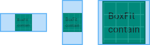
BoxFit说明
enum BoxFit {
/// Fill the target box by distorting the source's aspect ratio.
///
/// 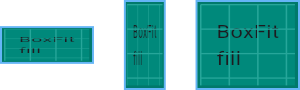
fill,//就是拉伸child铺满parent
/// As large as possible while still containing the source entirely within the
/// target box.
///
/// 
contain,//不变形的前提下拉伸child
/// As small as possible while still covering the entire target box.
///
/// 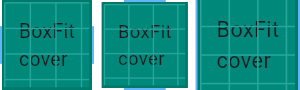
cover,//不变形的前提,铺满整个parent,所以可能有部分不可见
/// Make sure the full width of the source is shown, regardless of
/// whether this means the source overflows the target box vertically.
///
/// 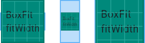
fitWidth,//保证child的宽度和parent一样
/// Make sure the full height of the source is shown, regardless of
/// whether this means the source overflows the target box horizontally.
///
/// 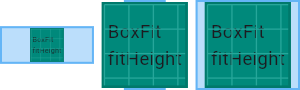
fitHeight,//保证child的高度和parent一样
/// Align the source within the target box (by default, centering) and discard
/// any portions of the source that lie outside the box.
///
/// The source image is not resized.
///
/// 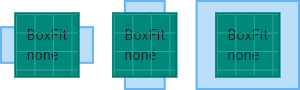
none,//不对child做任何处理,比parent小正常显示,比parent大,那么被裁剪,也就是部分不显示
/// Align the source within the target box (by default, centering) and, if
/// necessary, scale the source down to ensure that the source fits within the
/// box.
///
/// This is the same as `contain` if that would shrink the image, otherwise it
/// is the same as `none`.
///
/// 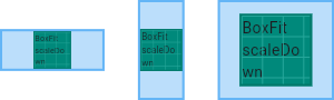
scaleDown,//child比容器大的话,进行缩小,否则原图显示
}
下图是容器比child大的情况

- AspectRatio
一个widget,试图将子widget的大小指定为某个特定的长宽比
  const AspectRatio({
    Key key,
    @required this.aspectRatio,//宽高比
    Widget child,
  })
- ConstrainedBox
对其子项施加附加约束的widget
  ConstrainedBox({
    Key key,
    @required this.constraints,
    Widget child,
  })
- Baseline
A widget that positions its child according to the child's baseline.
  const Baseline({
    Key key,
    @required this.baseline,
    @required this.baselineType,
    Widget child,
  })

  /// The number of logical pixels from the top of this box at which to position  the child's baseline.
  final double baseline;
demo
              Baseline(
                baseline: 50.0,
                baselineType: TextBaseline.alphabetic,
                child: Text(
                  "Hellogbefpqrey",
                  style: TextStyle(backgroundColor: Colors.deepPurple,fontSize: 35),
                ),
              ),
baseline看上去就像往下偏移了50,如下蓝线的距离

- FractionallySizedBox
一个widget,它把它的子项放在可用空间的一小部分,子控件的大小按照容器大小的百分比【这里是因子factor】,比如widthFactor是0.5,那么child的宽就是SizedBox宽的一半
  const FractionallySizedBox({
    Key key,
    this.alignment = Alignment.center,
    this.widthFactor,
    this.heightFactor,
    Widget child,
  })
demo
              Container(
                constraints: BoxConstraints.expand(width: 200, height: 100),
                decoration: BoxDecoration(border: Border.all()),
                child: FractionallySizedBox(
                  widthFactor: 0.5,
                  heightFactor: 0.5,
                  child: Container(
                    decoration: BoxDecoration(border: Border.all()),
                    width: 100,
                    height: 100,
                  ),
                ),
              ),
可以看到child本来是宽高100的,结果最后成了宽100,高50的矩形了,也就是父容器宽高乘以factor 0.5

- IntrinsicHeight
child的宽高是step的倍数,不是的话会增加
  const IntrinsicWidth({ Key key, this.stepWidth, this.stepHeight, Widget child })
/// If non-null, force the child's width to be a multiple of this value.
  final double stepWidth;
  /// If non-null, force the child's height to be a multiple of this value.
  ///
  /// If null or 0.0 the child's height will not be constrained.
  ///
  /// This value must not be negative.
  final double stepHeight;
demo
              IntrinsicWidth(
                stepWidth: 20,
                stepHeight: 20,
                child: Container(
                  decoration: BoxDecoration(border: Border.all()),
                  width: 85,
                  height: 85,
                ),
              )
step是20,child的width是85明显不是20的倍数,所以最终child的宽是100,高也是100
- IntrinsicWidth
和10一样 - LimitedBox
一个当其自身不受约束时才限制其大小的盒子
  const LimitedBox({
    Key key,
    this.maxWidth = double.infinity,
    this.maxHeight = double.infinity,
    Widget child,
  })
demo
上边说过,测试都是在Column里测试的,所以宽度是铺满屏幕的,高度不确定
所以下边的结果child最终的大小不是5050,而是8550
为啥?只有自身不受约束的时候max才生效,这里宽度是有约束的,所以max无效,而高度是无限的,所以约束生效
              LimitedBox(
                maxWidth: 50,
                maxHeight: 50,
                child: Container(
                  decoration: BoxDecoration(border: Border.all()),
                  width: 85,
                  height: 85,
                ),
              )
- Offstage
一个布局widget,可以控制其子widget的显示和隐藏
offstage 为true不可见,为false可见
const Offstage({ Key key, this.offstage = true, Widget child })
- OverflowBox
对其子项施加不同约束的widget,它可能允许子项溢出父级
  const OverflowBox({
    Key key,
    this.alignment = Alignment.center,
    this.minWidth,
    this.maxWidth,
    this.minHeight,
    this.maxHeight,
    Widget child,
  })
demo
              Container(
                height: 100,
                decoration: BoxDecoration(border: Border.all()),
                child: OverflowBox(
                  minWidth: 20,
                  minHeight: 20,
                  maxWidth: 50,
                  maxHeight: 150,
                  alignment: Alignment.topCenter,
                  child: Container(
                    decoration: BoxDecoration(border: Border.all()),
                    width: 85,
                    height: 185,
                  ),
                ),
              ),
最终的高度是150,超过了容器本身的高度100

- SizedBox
一个特定大小的盒子。这个widget强制它的孩子有一个特定的宽度和高度。如果宽度或高度为NULL,则此widget将调整自身大小以匹配该维度中的孩子的大小
const SizedBox({ Key key, this.width, this.height, Widget child })
- SizedOverflowBox
一个特定大小的widget,但是会将它的原始约束传递给它的孩子,它可能会溢出
  const SizedOverflowBox({
    Key key,
    @required this.size,
    this.alignment = Alignment.center,
    Widget child,
  })
demo
              SizedOverflowBox(
                size: Size(100, 50),
                child: Container(
                  decoration: BoxDecoration(border: Border.all()),
                  width: 85,
                  height: 185,
                ),
              ),
红框部分100*50是原本的size大小,可以看到实际显示的是85*185的框框,因为默认的alignment是center,所以实际的child是以红框为中心的

- Transform
在绘制子widget之前应用转换的widget
  const Transform({
    Key key,
    @required this.transform,
    this.origin,
    this.alignment,
    this.transformHitTests = true,
    Widget child,
  })
demo
              Transform(
                transform: Matrix4.translationValues(-100, 0, 0),
                child: Container(
                  decoration: BoxDecoration(border: Border.all()),
                  width: 100,
                  height: 50,
                ),
              ),
简单的左移了100

- CustomSingleChildLayout
一个自定义的拥有单个子widget的布局widget
  const CustomSingleChildLayout({
    Key key,
    @required this.delegate,
    Widget child,
  })
demo
              CustomSingleChildLayout(
                delegate: SingleX(),
                child: Container(
                  decoration: BoxDecoration(border: Border.all()),
                  width: 100,
                  height: 50,
                ),
              ),
delegate
class SingleX extends SingleChildLayoutDelegate {
  @override
  bool shouldRelayout(SingleChildLayoutDelegate oldDelegate) {
    return false;
  }

//返回容器的大小,对于CustomSingleChildLayout的父容器宽或高是无限的情况下,这里必须返回具体的宽高
  @override
  Size getSize(BoxConstraints constraints) {
    return Size(200.0, 200.0);
  }

//可以添加对child的约束
  @override
  BoxConstraints getConstraintsForChild(BoxConstraints constraints) {
    return BoxConstraints.expand(width: 30,height: 30);
  }

//可以对child进行一些平移
  @override
  Offset getPositionForChild(Size size, Size childSize) {
    return super.getPositionForChild(size, childSize);
  }
}
下边的效果图,上边delegate就返回了个size 50*50

